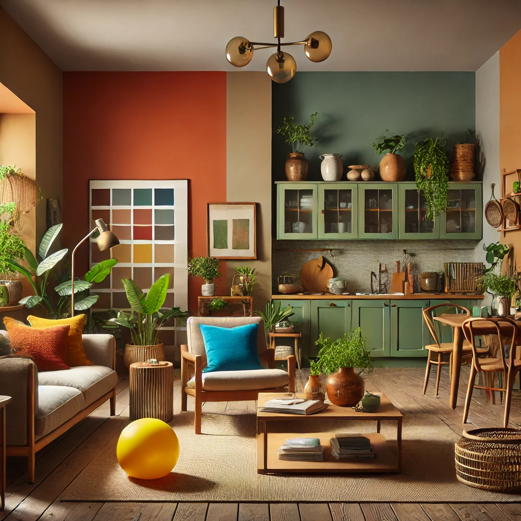
The world of interior design is constantly evolving, with colours playing a pivotal role in setting the tone for stylish and comfortable living spaces. As we step into 2025, the trends in colour palettes are shifting towards a blend of bold, soothing, and nature-inspired tones. In this article, we will explore the most prominent colour trends of the year and provide practical tips on how to incorporate them into your home decor.
If you’d like to learn more about earthy tones, there’s an article I wrote that delves deeper into the topic. You can click on “search” on the right-hand side of the page or click on this link to access it: https://pegaessanoticia.com/earthy-tones-in-interior-design-how-to-use-them-elegantly/
1. Embracing Nature with Earthy Tones
Where to Use Earthy Tones: Earthy tones like terracotta, olive green, and muted browns are ideal for creating a warm and inviting atmosphere. These colours are particularly suited for living rooms, bedrooms, and dining areas, where they can foster a sense of relaxation and comfort. In regions with colder climates, earthy tones can add a layer of warmth, making spaces feel more cosy and welcoming.
How to Incorporate Earthy Tones: For colder climates, use terracotta on an accent wall to bring in a sense of warmth. Complement this with natural wooden furniture and accessories like ceramic vases or woven baskets. In warmer climates, olive green can create a refreshing and calming effect, especially when paired with light-coloured furniture and airy fabrics. In both cases, adding indoor plants will enhance the natural feel, blending seamlessly with the earthy colour scheme.
What Combines Well with Earthy Tones: These tones pair beautifully with natural materials like wood, stone, and leather. To add depth, consider incorporating textures through rugs, cushions, and throws in complementary shades like cream or rust. Metallic accents, such as bronze or brass fixtures, can also elevate the overall look by adding a touch of sophistication.
2. Bold and Bright: The Revival of Vibrant Colours
Where to Use Vibrant Colours: Vibrant colours are excellent for energising spaces like home offices, kitchens, or even children’s playrooms. In climates with long winters and limited daylight, bold colours like electric blue or sunshine yellow can help brighten up the interior and create a cheerful atmosphere.
How to Incorporate Vibrant Colours: In colder regions, using vibrant colours can counteract the dreariness of the weather. For instance, a bright yellow backsplash in the kitchen can bring a sense of sunshine indoors. In warmer climates, these colours can be used more sparingly to prevent overwhelming the space. Opt for bright accessories like cushions, artwork, or a statement piece of furniture to add a pop of colour without dominating the room.
What Combines Well with Vibrant Colours: Pair vibrant colours with neutral backdrops to balance the intensity. For example, a white or light grey wall can serve as a canvas for colourful furniture and accessories. Additionally, materials like glass, metal, and even polished wood can enhance the vibrancy without clashing, maintaining a clean and modern aesthetic.

3. Soothing Neutrals for a Calming Atmosphere
Where to Use Soothing Neutrals: Neutral tones are incredibly versatile and can be used throughout the home to create a serene and harmonious environment. In hot climates, neutral shades like warm beige or creamy whites can help keep interiors cool and airy. In cooler climates, these colours offer a soft and inviting ambiance that can make rooms feel more comfortable and less stark.
How to Incorporate Soothing Neutrals: In warmer regions, use lighter neutrals for walls and larger furniture pieces to reflect natural light and enhance the sense of space. In colder areas, layering neutrals with textures like woollen throws, fluffy rugs, and heavier curtains can add warmth without deviating from a calm palette.
What Combines Well with Soothing Neutrals: Soothing neutrals work well with a variety of materials and textures. Natural elements like cotton, wool, and linen add a tactile dimension that complements the softness of neutral tones. Subtle metallic finishes in gold or silver can provide an elegant contrast, while greenery through houseplants adds a touch of life and colour.
4. Mixing the Old with the New: Retro Revival
Where to Use Retro Colours: Retro colours are ideal for creating a nostalgic yet modern feel in dining rooms, kitchens, or even living spaces. In cooler climates, these tones can add a sense of warmth and character, while in warmer climates, they bring a quirky charm without overpowering the space.
How to Incorporate Retro Colours: For cooler regions, consider using mustard yellow or burnt orange in upholstery or wall accents to inject warmth and vibrancy. In warmer climates, avocado green can be a subtle nod to retro style without making the space feel too heavy. These colours can be introduced through vintage-inspired furniture, retro appliances, or even patterned wallpapers.
What Combines Well with Retro Colours: Retro colours blend beautifully with mid-century modern furniture, which often features clean lines and natural wood tones. To avoid making the space feel dated, mix these colours with contemporary elements like sleek metal finishes or modern lighting fixtures. Accessories like patterned cushions or rugs can tie the retro theme together without overwhelming the decor.
Conclusion: A Colourful Year Ahead
The colour trends for 2025 offer a diverse range of options, from earthy tones that bring nature indoors to vibrant shades that inject life and energy into your spaces. Whether you prefer the soothing effect of warm neutrals or the charm of retro revival, there’s something for every style and taste. By carefully selecting and combining these colours, you can create a home that is not only on-trend but also a true reflection of your personality. So, embrace the colours of 2025 and transform your home into a haven of style and comfort.

